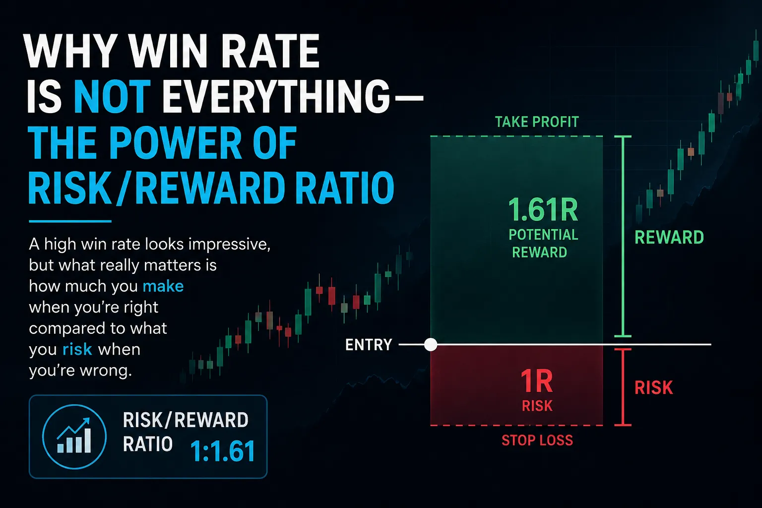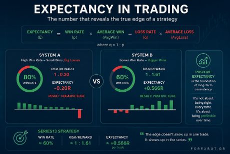
When evaluating a trading strategy, most investors focus on total return, win rate, or recent performance. While these metrics are important, they rarely tell the whole story.
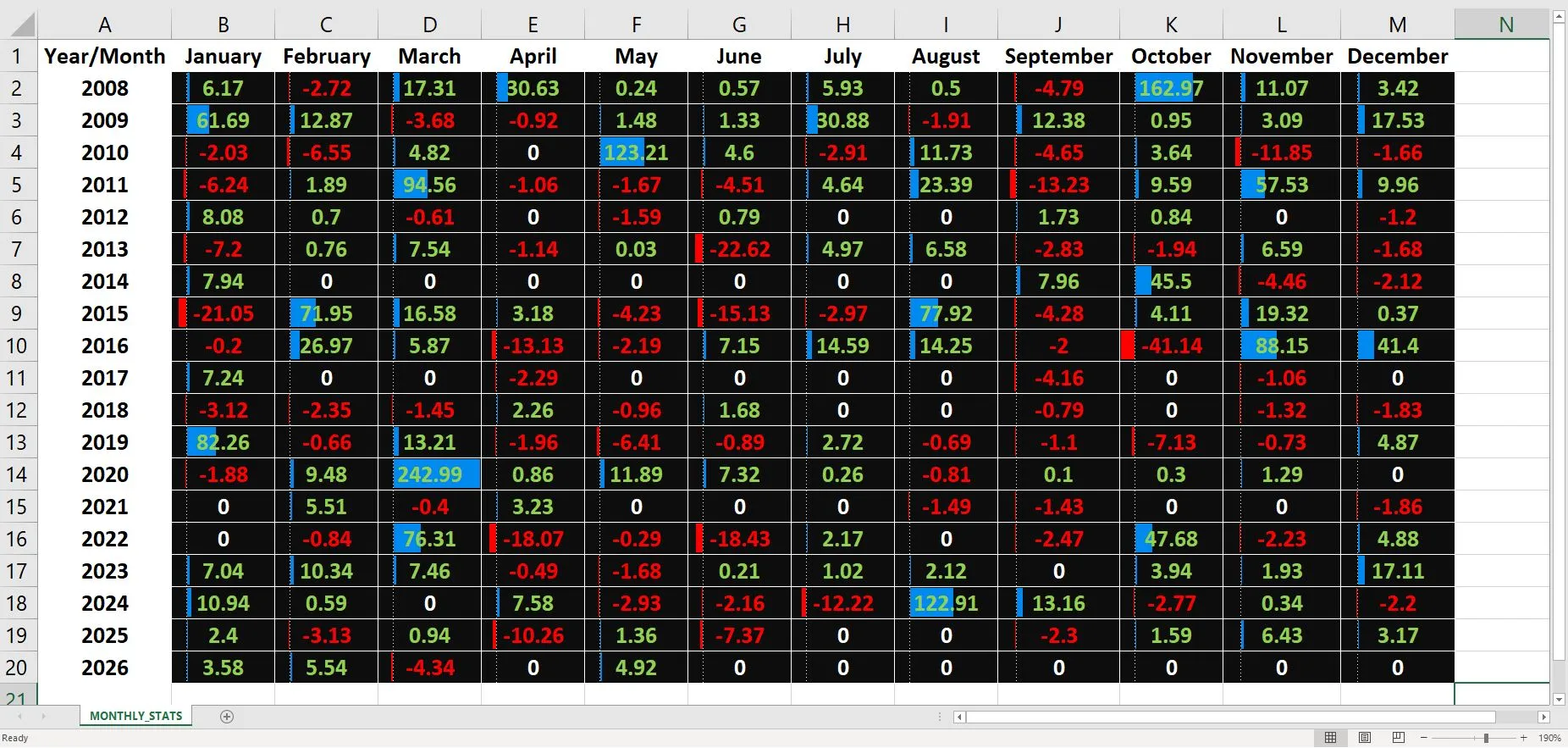
The monthly heatmap above presents strategy results from 2008 through 2026, covering a wide range of market environments including the Global Financial Crisis, the European debt crisis, the COVID-19 pandemic, major interest-rate cycles, and periods of elevated geopolitical uncertainty.
One of the most interesting observations is that performance is not distributed evenly over time. Most months produce relatively modest gains or losses, while a small number of exceptional months contribute a disproportionately large share of the overall return.
Examples include October 2008, May 2010, March 2020 and August 2024, periods characterized by unusually high market volatility. During such environments, the statistical edge of the strategy appears to express itself more strongly.
At the same time, losing months are generally smaller in magnitude than the strongest winning months. This does not eliminate risk, nor does it guarantee future profitability, but it illustrates how long-term performance can be influenced more by a handful of significant opportunities than by the average month.
This observation highlights an important principle of systematic trading: an edge does not need to appear every day, every week, or even every month. What matters is whether the edge remains present over a sufficiently large sample of trades and across multiple market cycles.
For this reason, monthly performance analysis can often be more informative than looking at an equity curve alone. It provides insight into how returns are distributed, how the strategy behaves during periods of stress, and where its long-term statistical advantage may originate.
Historical results are presented for educational and informational purposes only and should not be interpreted as investment advice or as a guarantee of future performance.